Company ········· Brex
Creative Director ........ Heather Hale
Agency Partner ········· Studio Freight
3D Animation ········· Bruno Nogueira
2D Animation ········· Josephine Lwin, Latham Arnott
Project······ Brand Refresh
Creative Director ........ Heather Hale
Agency Partner ········· Studio Freight
3D Animation ········· Bruno Nogueira
2D Animation ········· Josephine Lwin, Latham Arnott
Project······ Brand Refresh
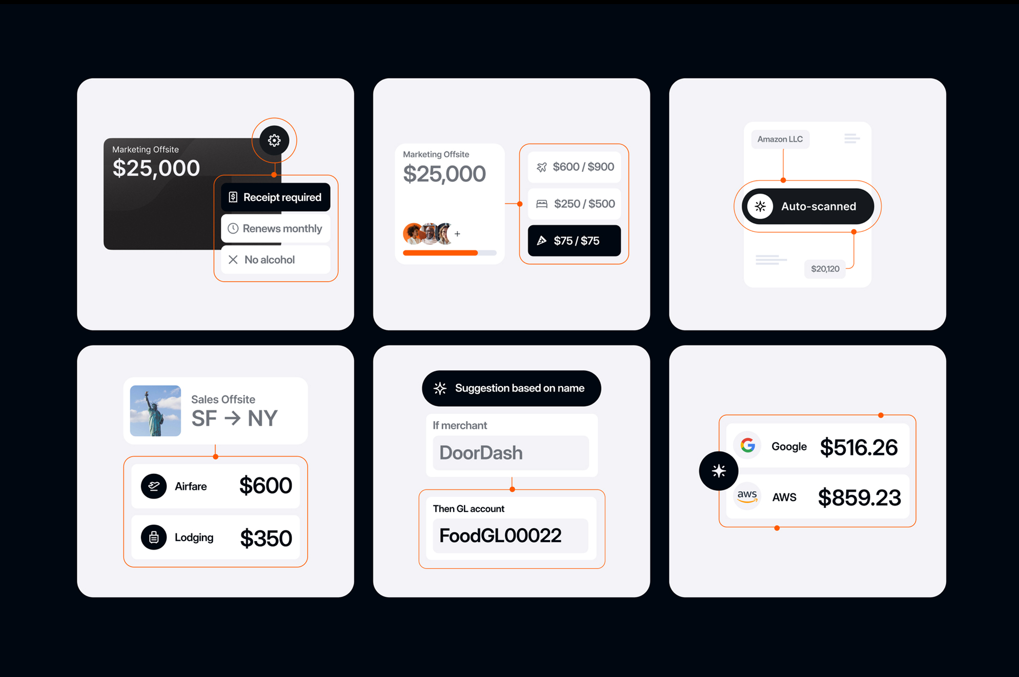
Brex Brand Refresh
Since its founding in 2017, Brex has made bold decisions and pivoted over the years to adapt to a shifting market.
Naturally, each strategic shift has brought with it a slight evolution of the visual brand. Brex 3.0 introduced a commitment to consistency and a clear roadmap for 2024, setting the stage for a brand refresh.
Working closely with company leaders, we defined a brand archetype that would guide decisions across strategy, tone, color, and the overall essence of the brand refresh.
After achieving internal clarity, we partnered with Studio Freight to bring the new vision of Brex to life. The result is a visual brand that confidently embraces its orange origins and boldly establishes itself as the industry leader in modern spend management.


Client ········ Marie Forleo International
Art Direction ······· Heather Hale, Meg Long
Web Design + Interactive ······ Heather Hale, Meg Long
Event Design ...... Heather Hale
Creative Director ······ Geáda Ford
Photographer ...... Emily Shur
Lettering ...... Molly Jaques
Art Direction ······· Heather Hale, Meg Long
Web Design + Interactive ······ Heather Hale, Meg Long
Event Design ...... Heather Hale
Creative Director ······ Geáda Ford
Photographer ...... Emily Shur
Lettering ...... Molly Jaques
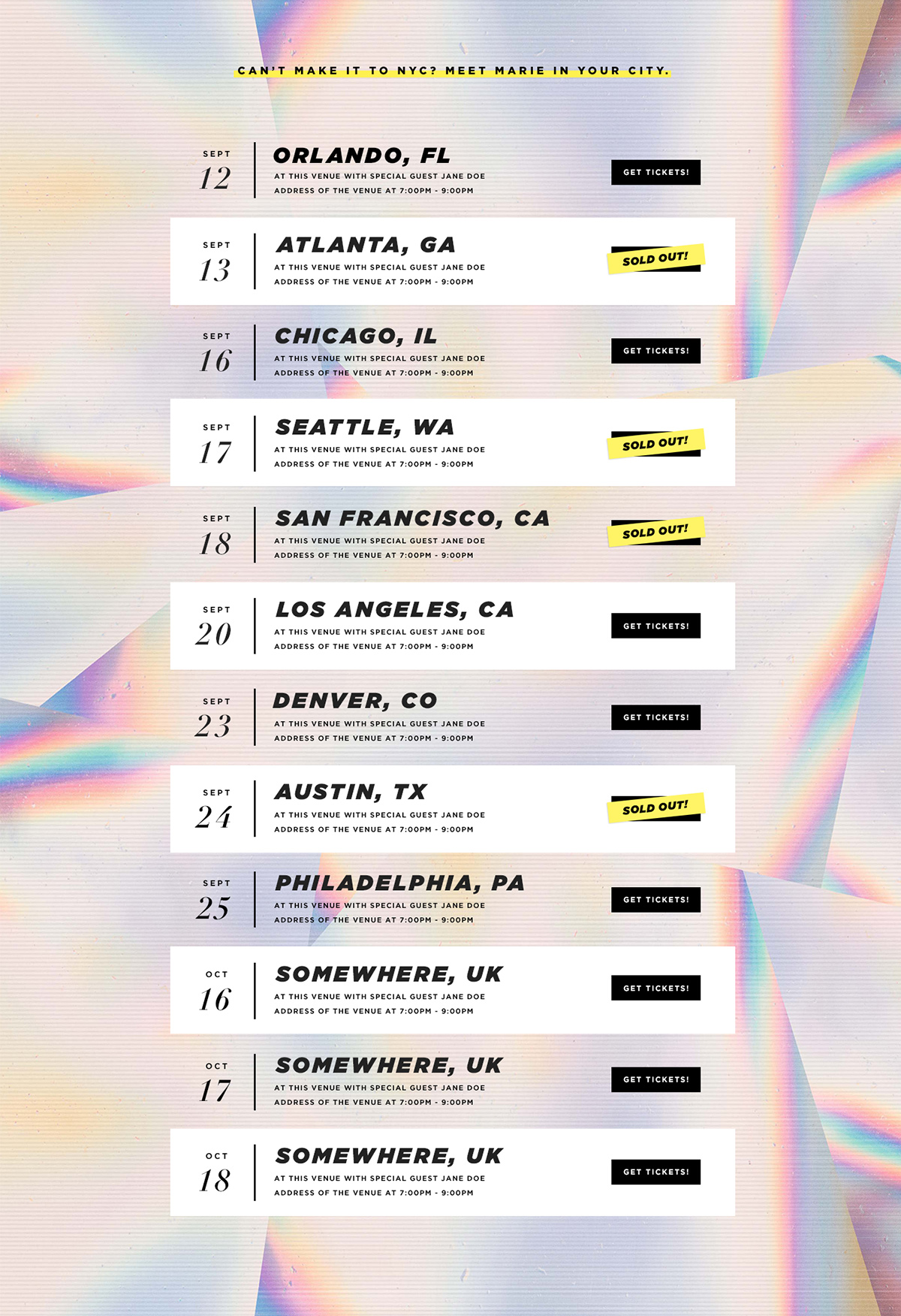
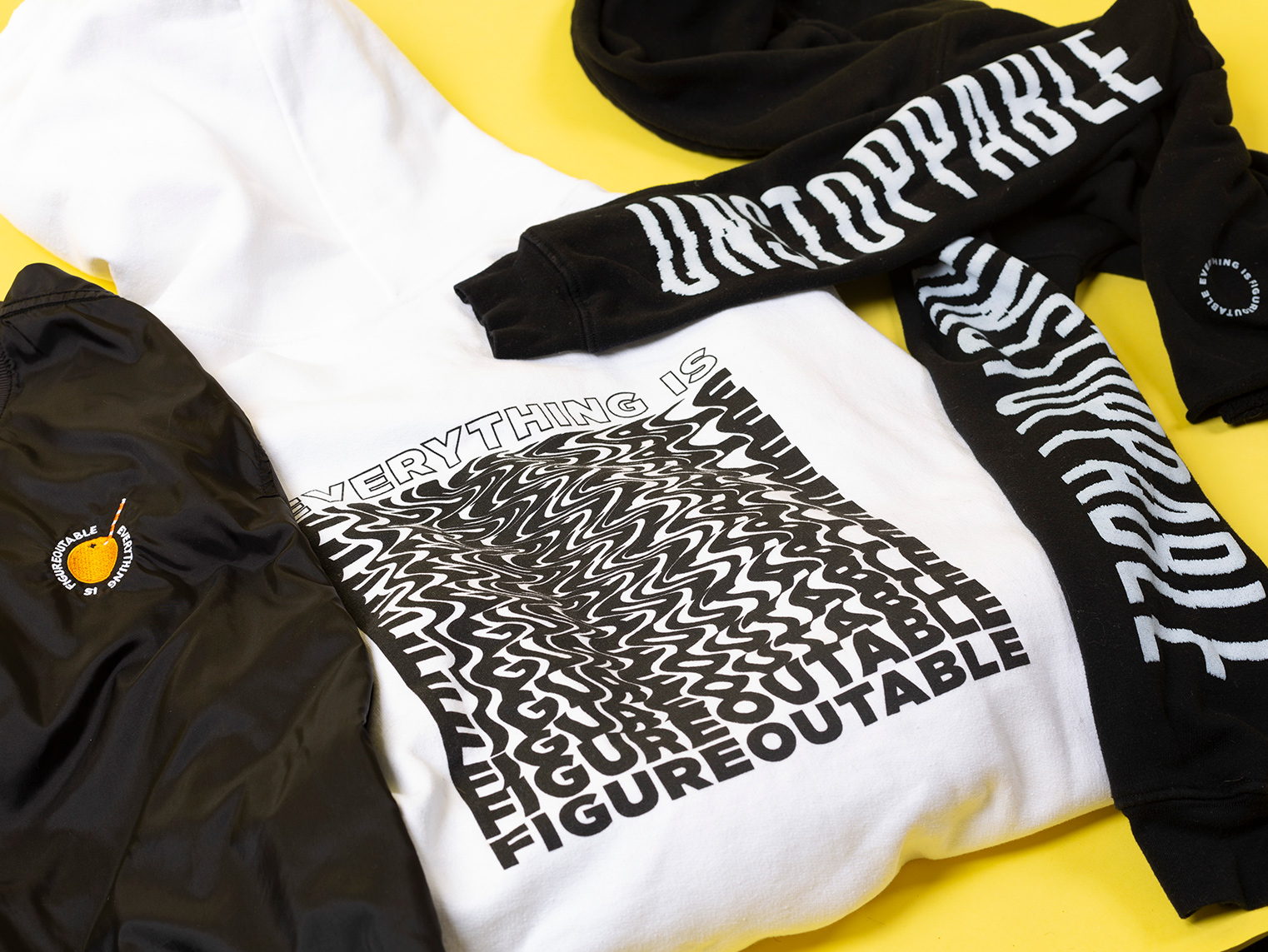
Everything Is Figureoutable
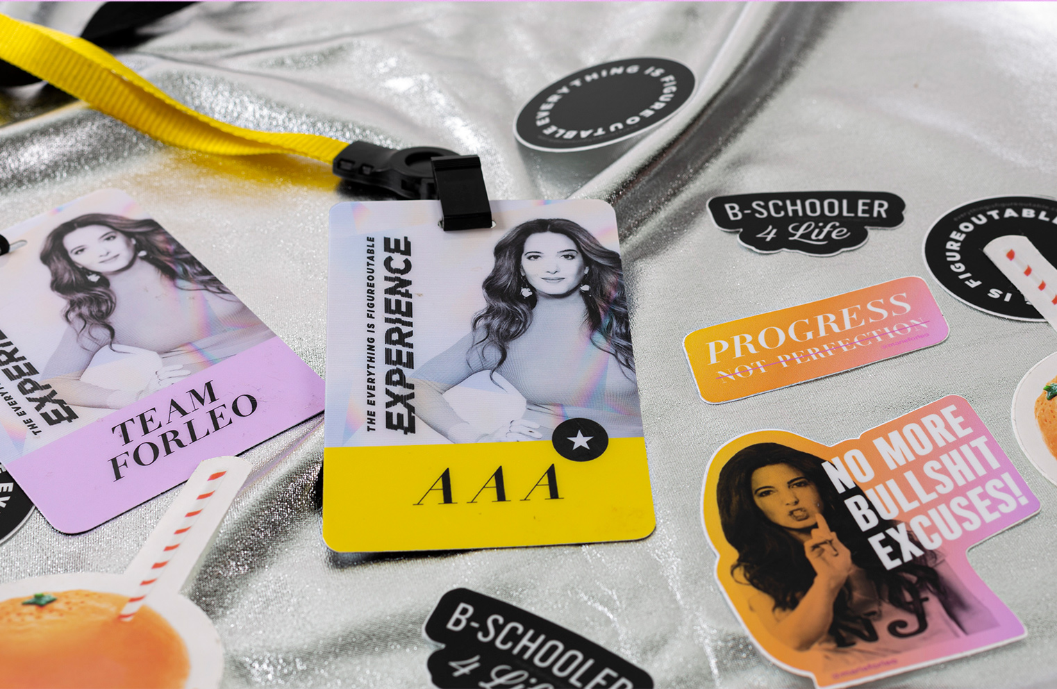
Marie Forleo’s book, “Everything Is Figureoutable” became an instant #1 New York Times Bestseller.
The in-house team was hard at work way before the book hit the shelves to build a brand around the launch. Environmental design, merch design, packaging design, web design ... all were present for this book baby.





Client ········· Columbia Theological Seminary
Lead Design ........ Heather Hale
Design ········· Alyssa Upp
Developer ······ Jason Cyr
Agency······ Metaleap Creative
Lead Design ........ Heather Hale
Design ········· Alyssa Upp
Developer ······ Jason Cyr
Agency······ Metaleap Creative
Columbia Theological Seminary
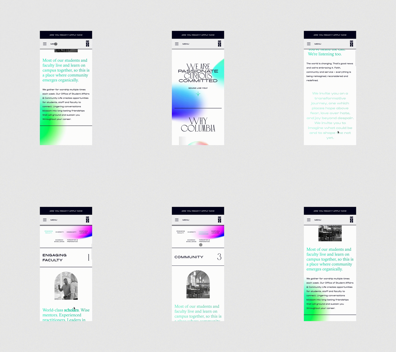
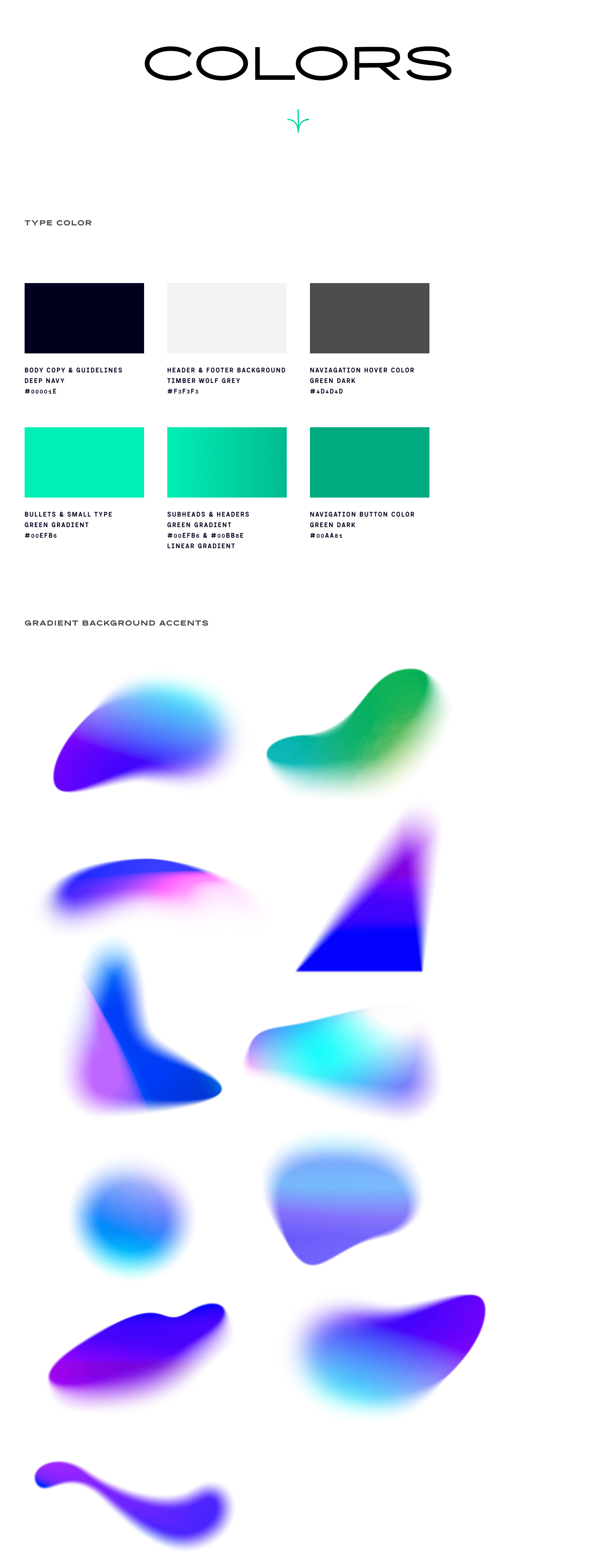
The admissions office initially came to us wanting a fresh campaign that would send a bold message of inclusion and belonging to individuals who were otherwise not welcome to serve as leaders in the church.
After working together to achieve the right message, imagery and overall look and feel, we began building out a microsite for the campaign.
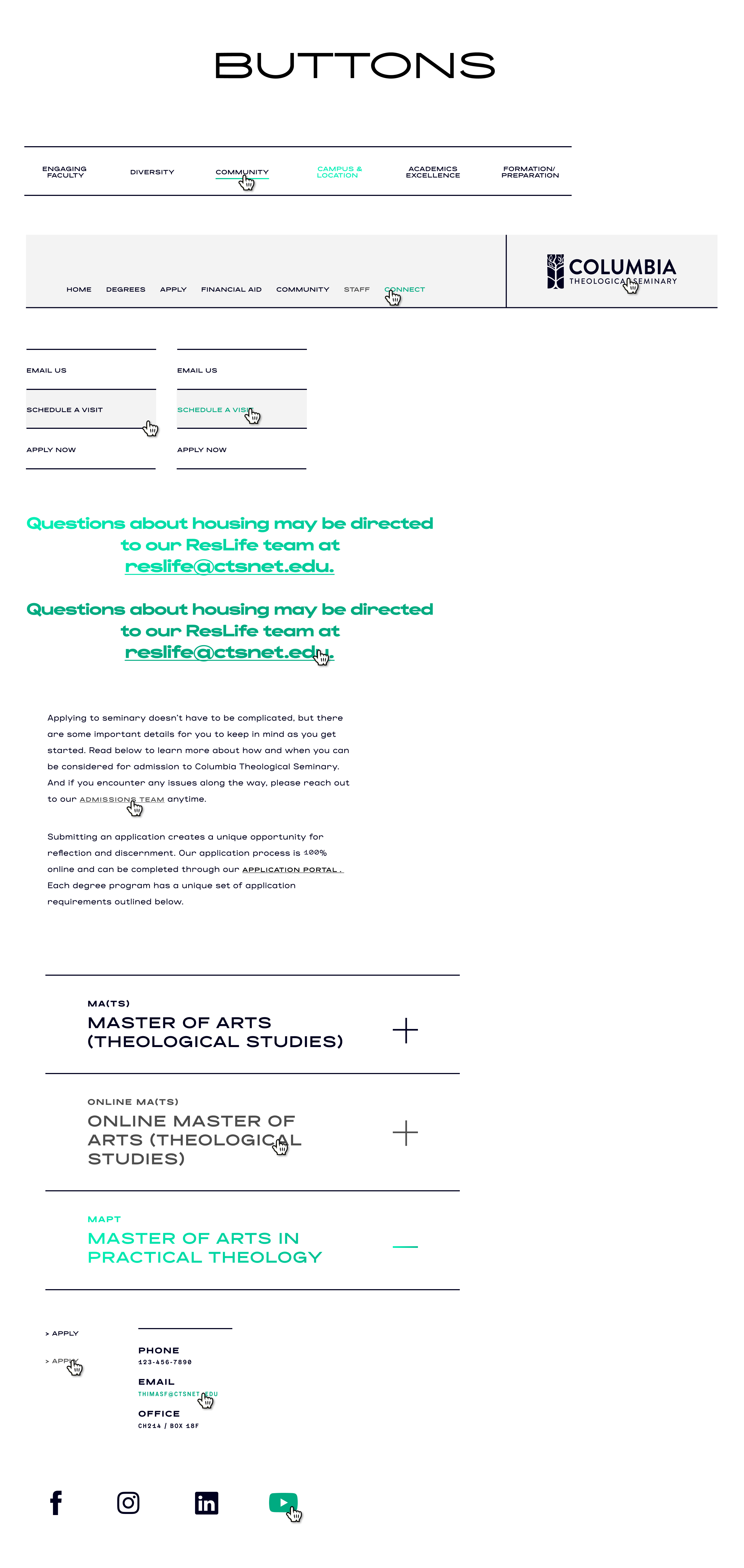
CTS already has a pretty robust website with a more academic/administrative design and function. The challenge was to create an experience for users that would not cause disruption or confusion when navigating back and forth between the two sites. We achieved this by using their current logo, but shifting it to black, making it an extension of the main brand. We also made sure that there were multiple ways to get navigate back to the main site, while keeping in mind the natural behaviors and expectations users have when navigating back to “home”.


Client ········· Dwell Bible App
Design ········· Heather Hale
Creative Director ······ José Reyes
Agency ······· Metaleap Creative
Design ········· Heather Hale
Creative Director ······ José Reyes
Agency ······· Metaleap Creative
Dwell Bible App
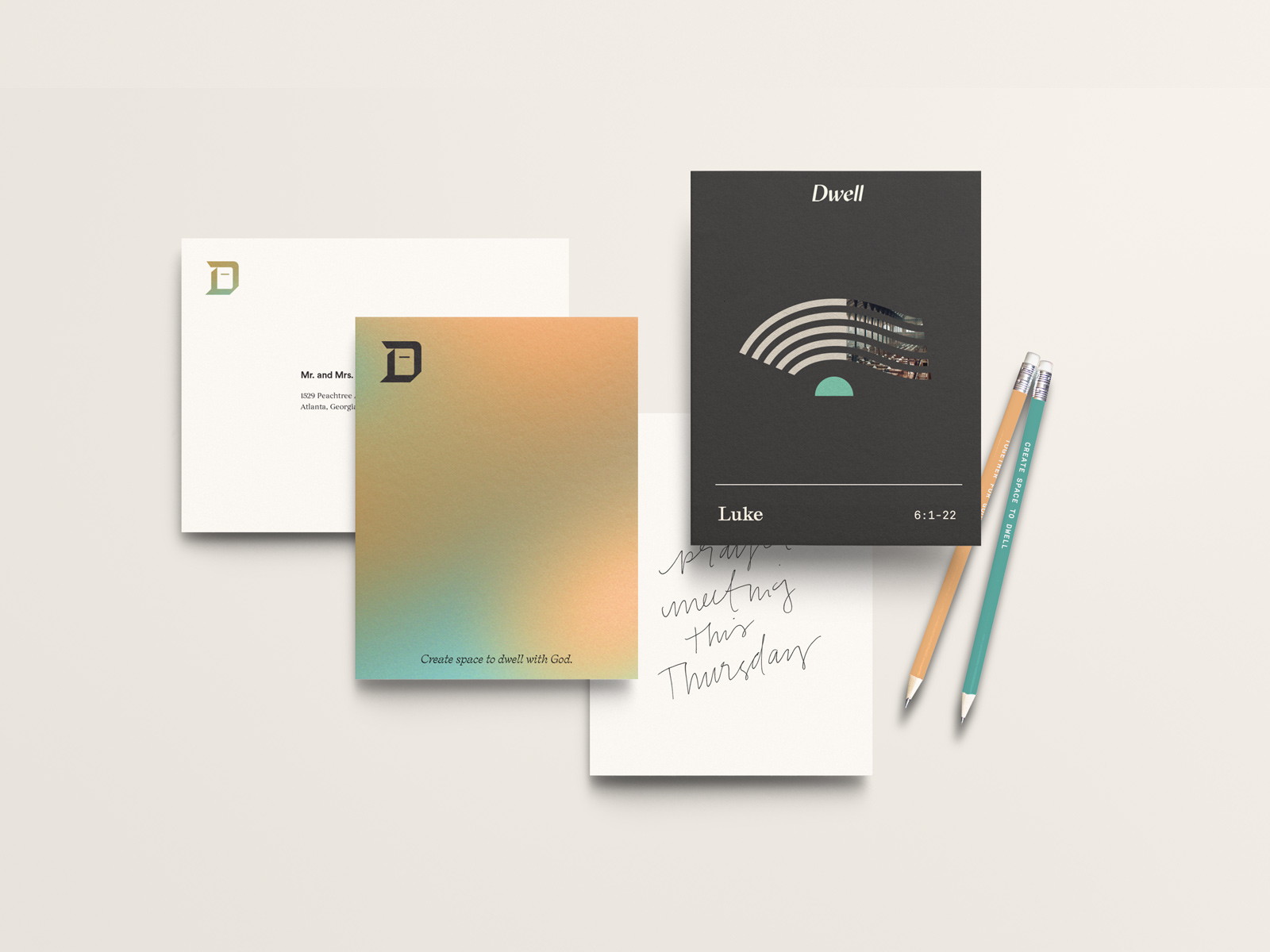
Dwell exists to help people be formed into the likeness of Christ by making ancient practices accessible to the modern world, rooting technology in Tradition.
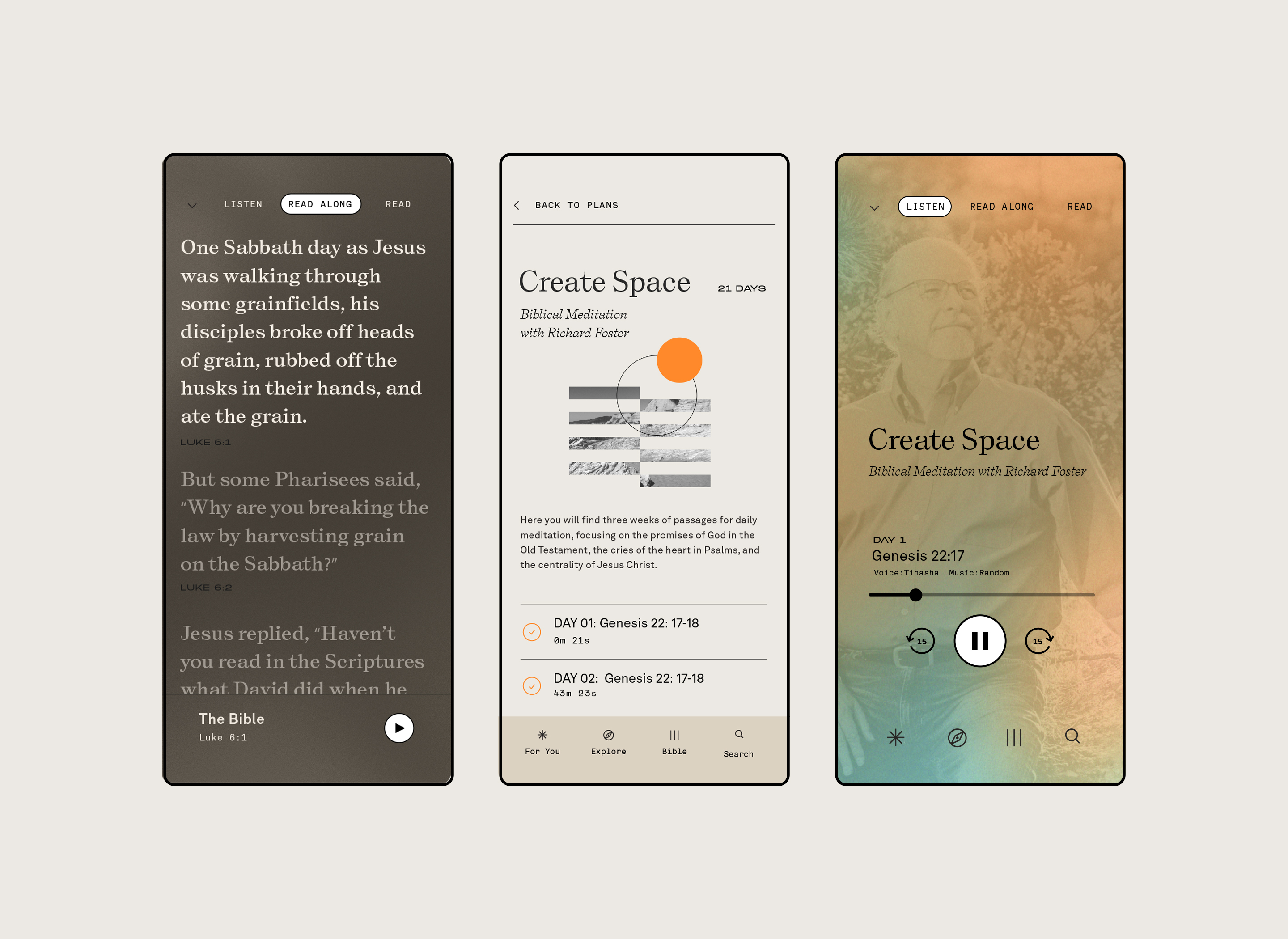
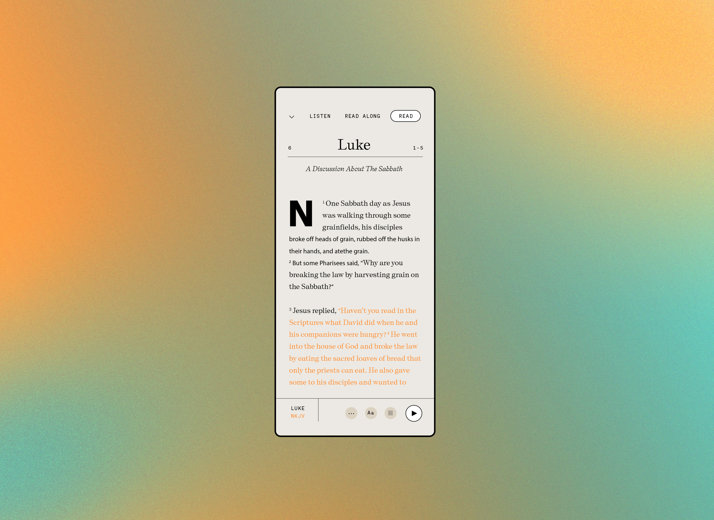
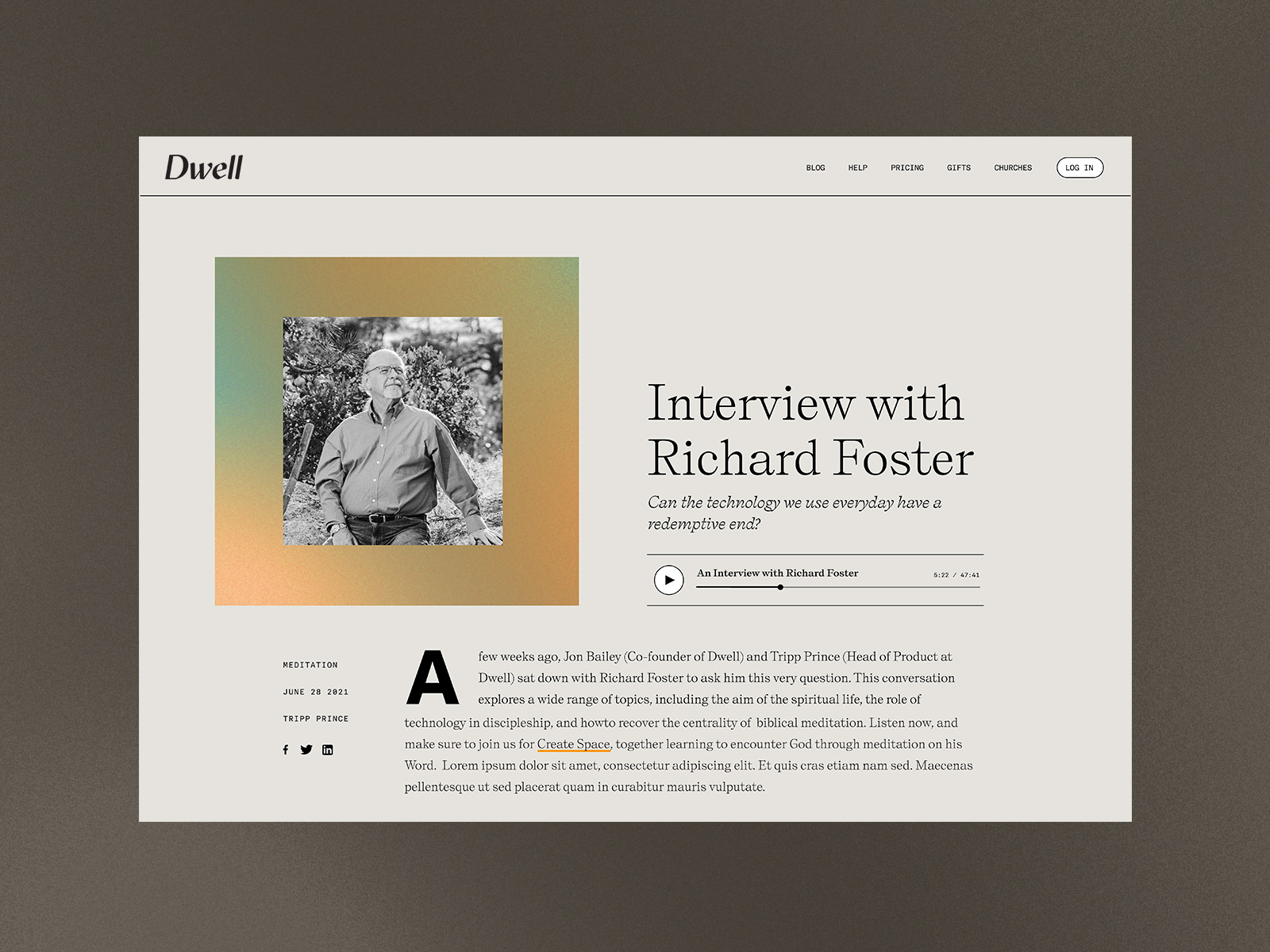
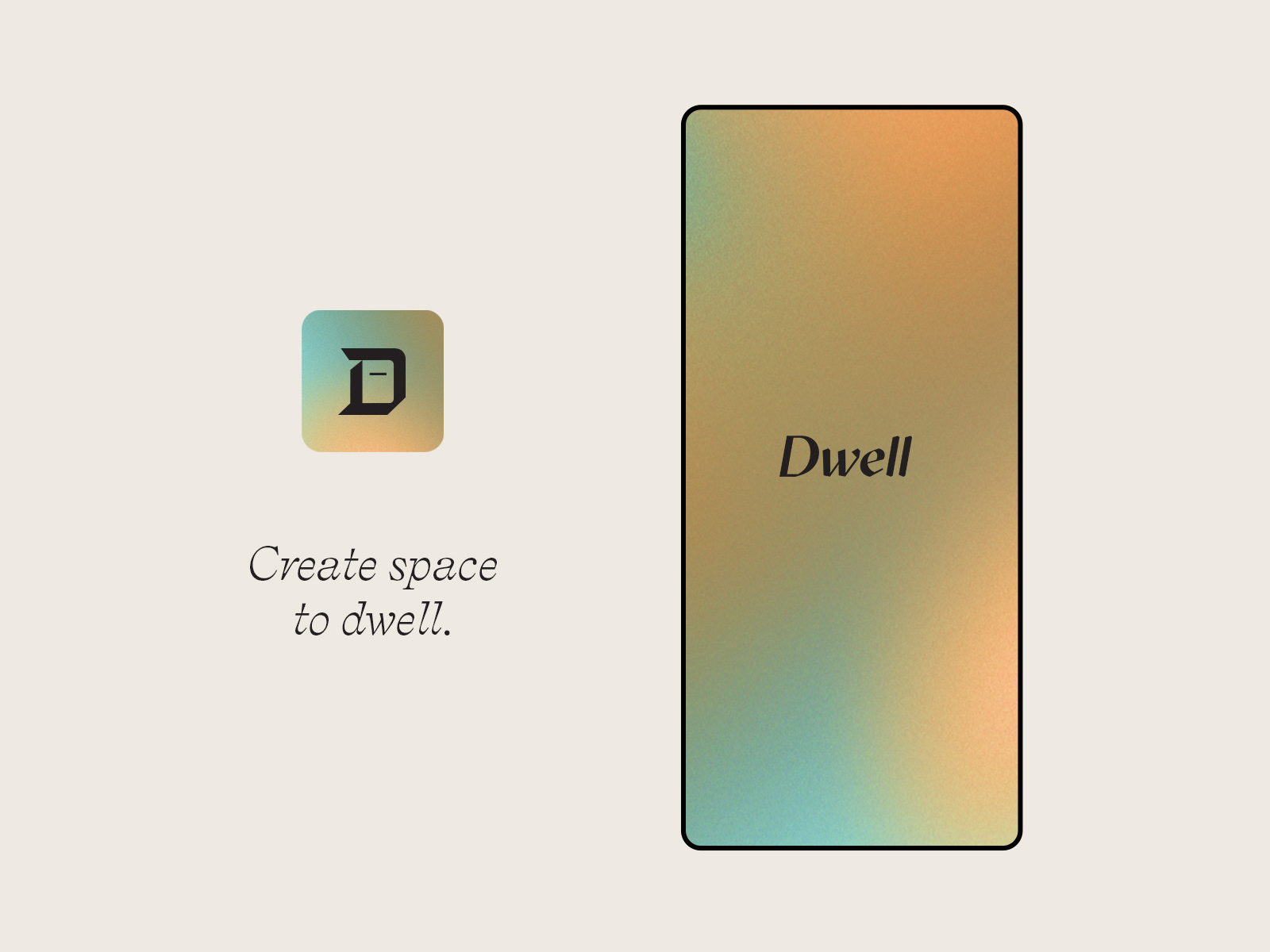
When Dwell came to us, the app had a generic tech look + feel. We were tasked with taking the brand from DIGITAL to TACTILE, ORDINARY to SOULFUL, GENERIC to UNIQUE.
Dwell 1.0 mimicked a music app. All content was experienced in the same player and connected to a unique piece of art in a square format. This quickly led to a VERY cluttered and confused experience. The desire was for the app to be a place of calm. Less like a music app and more like a meditation app.
We knew early on that one of the biggest problems to tackle was imagery. We worked together to create a hierarchical system that would allow art to be used as a guide and less like a collection of record album covers. The use of typography, color gradients and simple collage were a few ways we were able to visually streamline the experience for Dwell users.

Client ·········Sola Media
Design Lead ········· Heather Hale
Design ········· Elizabeth Hildreth
Creative Director ······ José Reyes
Agency ······· Metaleap Creative
Design Lead ········· Heather Hale
Design ········· Elizabeth Hildreth
Creative Director ······ José Reyes
Agency ······· Metaleap Creative
Sola Media
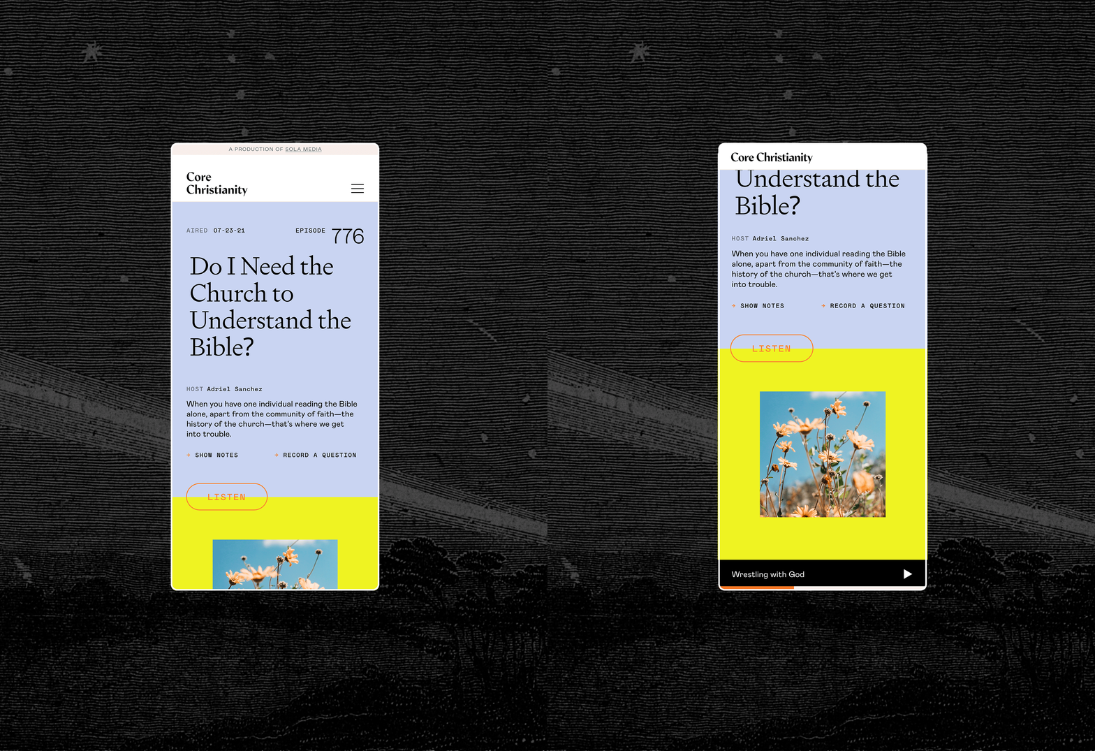
Core Christianity is a podcast and journal that sits within the Sola Media brand. After leading the charge on a rebrand for Sola Media, we were tasked with applying the new branding and type styles to the company’s web presence that spanned across 5 unique sites.
In our initial audit of Core Christianity’s site, we saw a lot of room for improvement. At the top of our list was incorporating a universal player that would allow users to browse and click into articles never losing access to the podcast player. This was especially important for the mobile experience.
